

Design Goals
Break the Rules
The site’s be wonderfully devoid of most styling for the last week or two now. I’ve been meditating on what to do and while I have no clue, I have some broad goals I’d like to achieve with the design:
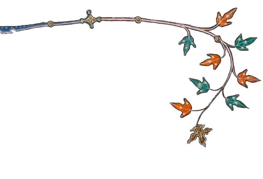
avoid straight lines and rigidly stacked boxes of content
different types of content (“micro” posts, long posts, kb articles, links, pictures, games, etc.) should all be displayed together, but with differing design queues to belay their level of importance (“micro” posts should be visually lesser than a long form post or game/thing)
embrace garish colors but don’t sacrifice readability
incorporate artistic work into the the site (ie use the image border-styles or add something to headers/footers other than just styled html elements)
lean into the TufteCSS design style for article/content layout when applicable
avoid embracing w3 standards “just because”
reflect something of who I am, what I love, what I do, etc. (don’t make it spaceships, I don’t care about space too much beyond stargazing)
Inspiration
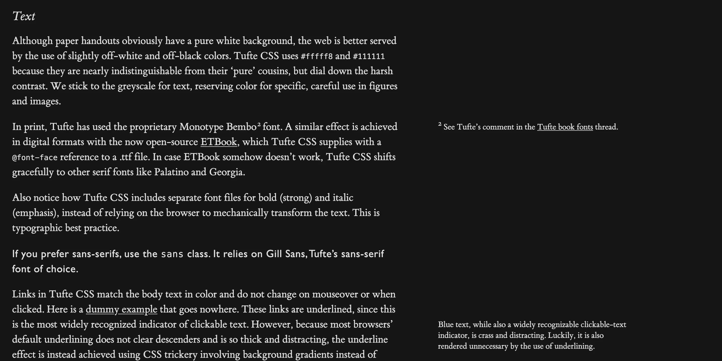 The content should be beautiful and the design should make readers want to read. I love how Tufte CSS really pulls the reader in, you want to read it because the layout of the content is so beautiful,1 the content surely is even more so!
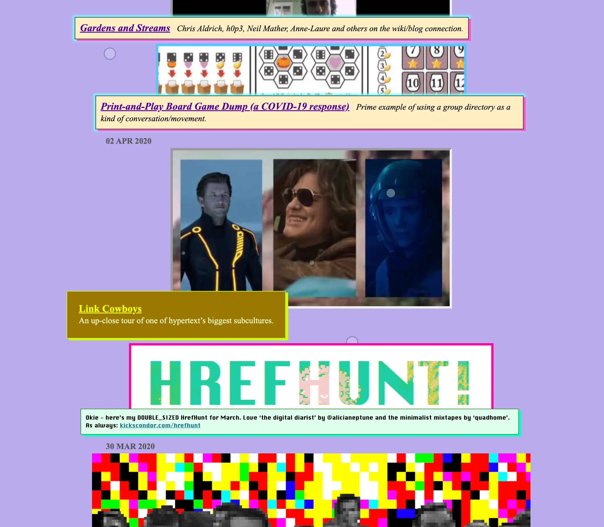
 I want to avoid the rigid design pattern that most/all sites follow. Think Kicks Condor.2
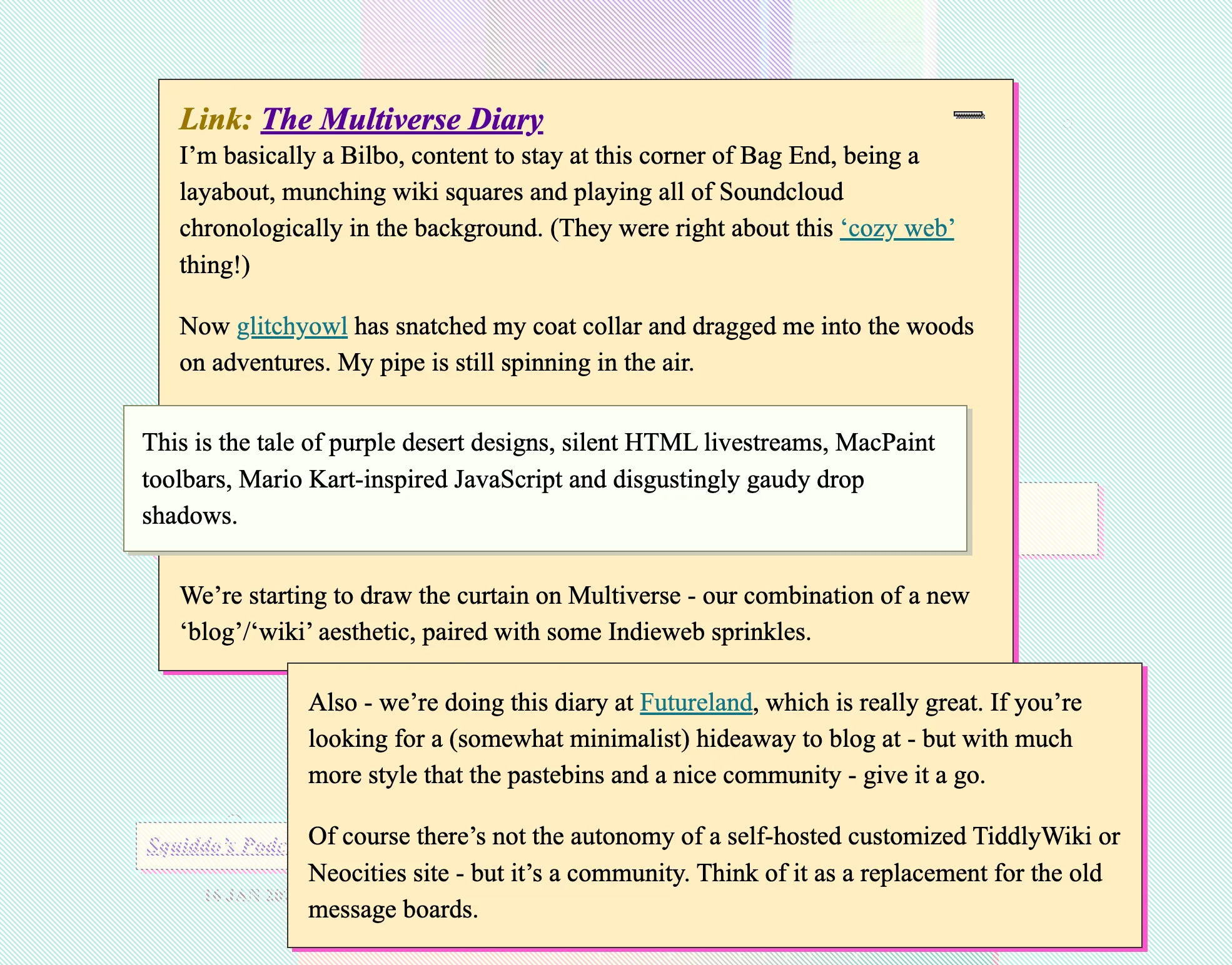
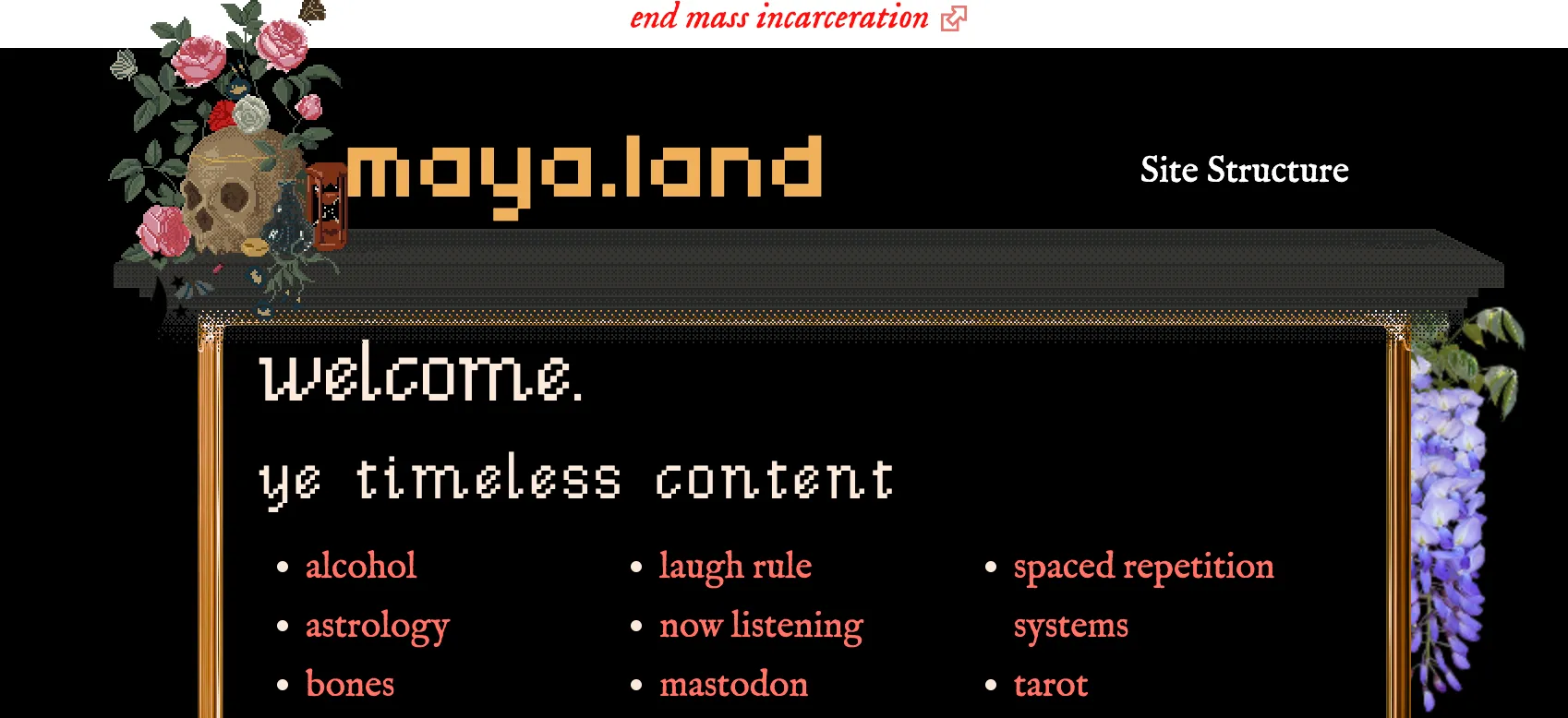 I love how Maya Land is able to take stock CSS features and create her own thing. I’d love to get some of my own pixel art into my site this way.
Footnotes:
: The font in use here is spectacular!
: I love the use staggering to break up the otherwise grid-like pattern most websites/content falls into